


Made with love, tears, and bootstrap
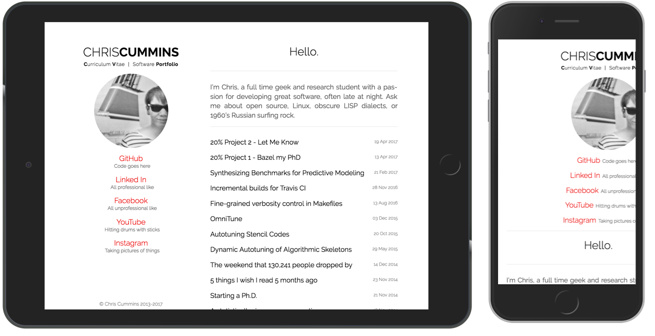
I’ve rebuilt this site with a fresh new look for the summer browsing season. Out with the old, in with the new. There was nothing inherently wrong about the previous design, but I did have a few gripes. Chiefly, it was designed with a “500px should be enough for anyone” attitude, which meant that on anything except a 2013-resolution laptop display, the site was either too sparse or poorly scaled:
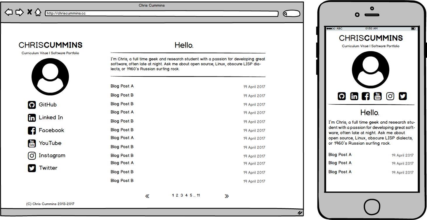
A few days ago when I had a moment to burn I fired up Balsamiq and mocked up a tweaked design. First, replacing the fixed-width content block with something that will scale, and secondly ensure that the header doesn’t become too unwieldy when squished down to single column view on a phone:
However, I quickly realized that when you change one thing, you may as well go ahead and tick all of the things off the wish list. So starting from a blank slate I roughly sketched up a new design, doubling down on a complete overhaul and opting for “hero image” branding:
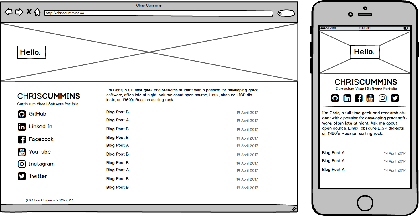
I preferred that. The oversize banner would allow me to add a bit of visual interest beyond that same repeated mugshot, and I have a stockpile of holiday snaps that I’ve been trying to find a purpose for. However, as with any first effort, it had some problems I needed to work through.
First among them was that the title was left floating in the top of the page, and when compressed down to single column width would awkwardly sandwich my name between the headline and the content. Also, right-side navigation is in- vogue. Let’s iterate:
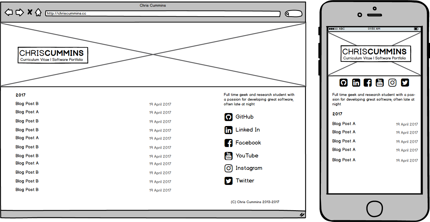
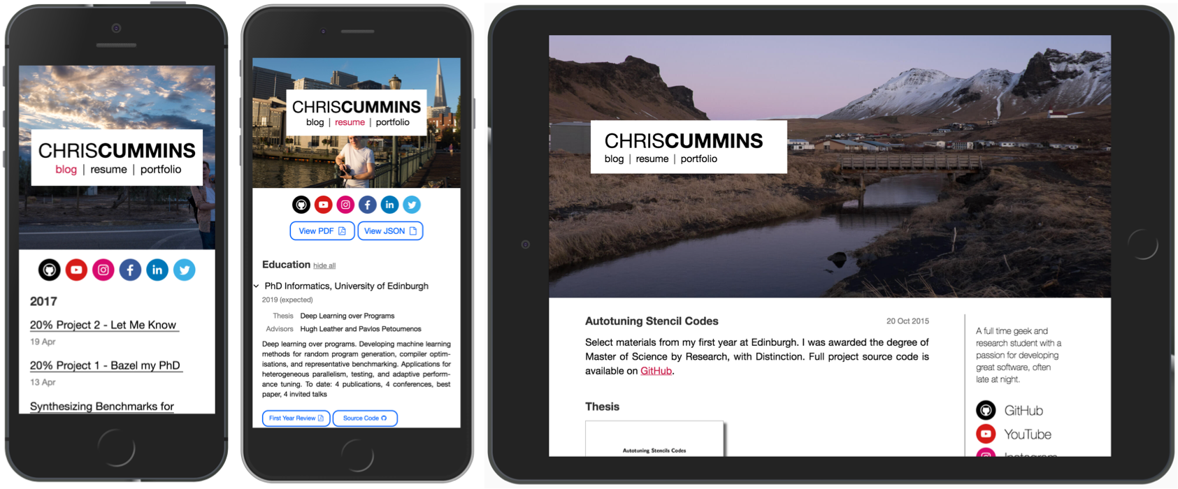
Better. We’ll put the title in the same block as the page content, and use the floating text over the image as the site’s navigation bar. I prefer this as it adds emphasis to the two most important links on my site: my resume and portfolio, which were a little under-emphasized in the old layout. Let’s switch to OmniGraffle for a high-fidelity mockup:
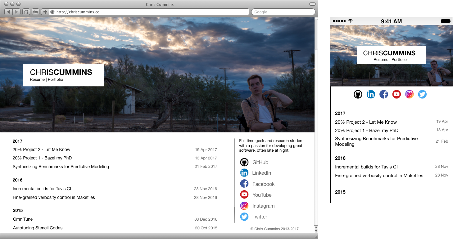
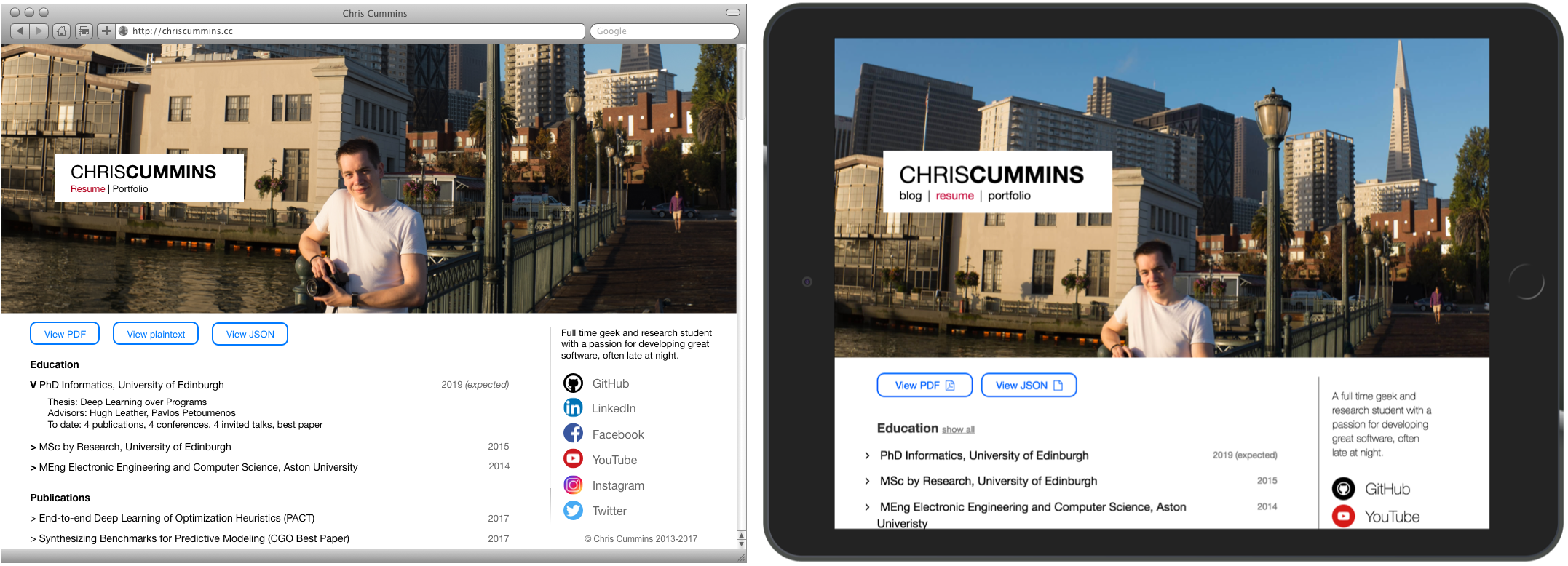
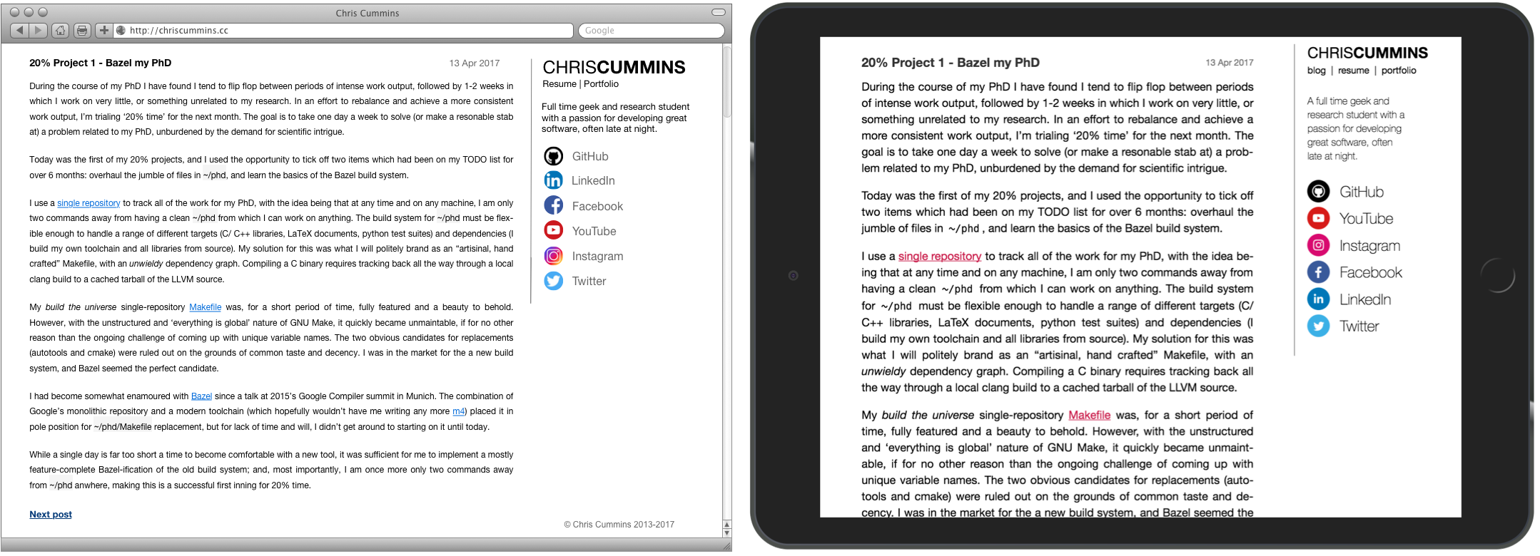
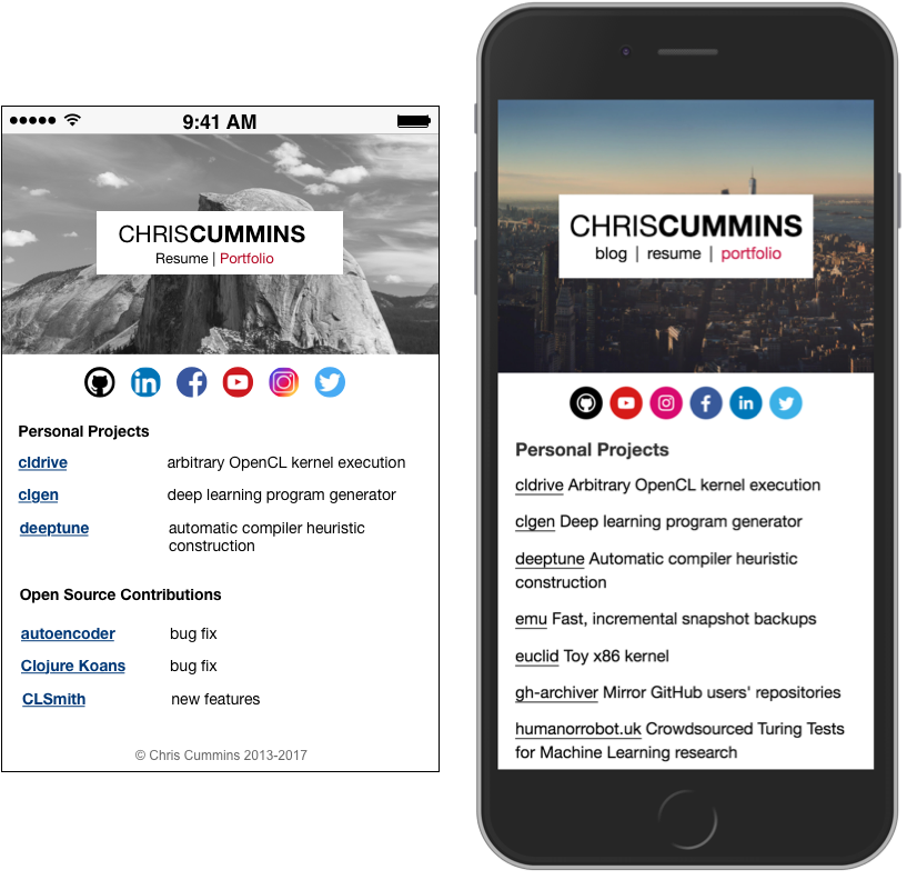
After spending an hour or so on minor tweaks, I was happy and ready to implement. I grabbed a copy of Bootstrap for the scaffolding, then spent a couple of days building up a living implementation of the mockups. The finished product is pretty true to the design that I mocked up, albeit with minor tweaks. Some side by side comparisons of OmniGraffle mockup (left) and the actual site (right):
Normally if I’m building a site I reach first for my text editor, and figure out the design on-the-fly, so working towards a preconceived plan was a refreshing change, and allowed me to focus more on the minor details. Not since making jusselme.com in 2012 have I spent so long iterating and refining the details, a few of which I particularly like are:
- subtle animations: the right column acts as a navigation bar when the banner image is out of view. There’s also a parallax behind the hero image because, you know, that’s what all the kids are doing.
- more templating: all of the content for the resume and portfolio are stored in a single JSON file, programatically instantiated to generate the HTML. Additionally, all the links within the site are now generated by Jekyll, which allows me to do things like set a
baseurlfor hosting a staging site. - page scaling: The transition from ultra large to tiny displays is incremental and fully accounted for. There are a number of small adjustments that page size is responsible for. E.g. dates next to titles “hang right” on desktop, but on narrow displays where real estate is limited, they slip under the title to make the most of limited screen width.
I’m pretty happy with this new design, and if it holds up like the previous one, then it should comfortably see me through to the end of the decade. If you find a bug or would like to suggest a change please do let me know. And of course, as always, the source code for this design is free software.